Urban design aesthetics as an obstacle
The benefits of "dumb boxes" and simple design

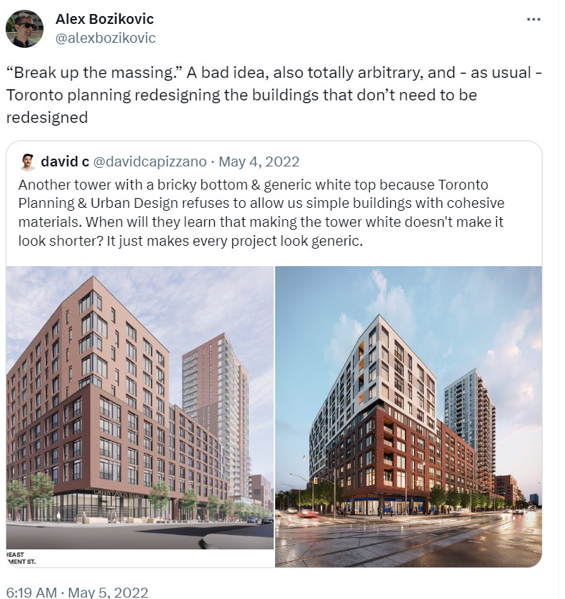
“Break up the massing” means “make your building look like two smaller buildings.” The jargon makes it sound like something you would learn in architecture school, but according to architects, it’s actually something you only hear from municipal design review boards, which focus on aesthetics.
For example, the Auckland Design Manual includes the following guidelines:
dividing a large form into several linked smaller forms to minimize visual impact
breaking down the mass of the building by recessing and projecting elements to avoid flat monotonous facades
Problem is, as Mike Eliason explains, the more complicated your building’s geometry is, the more expensive it is. In praise of dumb boxes:
Every time a building has to turn a corner, costs are added. New details are required, more flashing, more materials, more complicated roofing. Each move has a corresponding cost associated with it. Additional requirements like height setbacks in commercial zoned lots adjacent to residential zoned ones (a setback in section) have the same effect.
A hundred years ago, you’d build a four-sided box a few stories tall, and call it a day — unless you were building much taller in which case there were setback requirements associated with that). Today, because of increased setbacks and modulation requirements designed to make low and mid rise buildings look less massive/boxy, we’ve added several layers of cost on to a building.
You can see this strategy in older craftsman homes as well — the house is essentially a box in plan, with subtle additions outside the box (bay window, front porch, etc) to reduce the effect of the massing.
Eliason also notes that simpler buildings are more energy-efficient, helping to reduce operational costs: they have a smaller surface area, so they lose less heat.
To quote one of Dieter Rams’ design principles:
Good design is as little design as possible
Less, but better – because it concentrates on the essential aspects, and the products are not burdened with non-essentials.
A couple of Helen Lui’s war stories:
On a new rental project, someone wanted me to make my 19 storey building look less like a 19 storey building using different methods of sculpting the building so that each floor had a different footprint that didn't align, so that it would be more "interesting" for pedestrians
Another time a city planner wanted us to look at making a tower have L-shaped floors to make the building appear "smaller" which would have added another stairwell + 2 stairs and ????? costs
Does this make any sense? Did the regulators making these requests weigh the costs and benefits at all?
In Vancouver, there’s an Urban Design Panel which makes recommendations to council on aesthetic requirements for individual buildings. This includes even small rental apartment buildings: for example, see Appendix C of the staff report for 1805 Larch, a five-storey rental building with 20% non-market apartments.
More
For a counter-argument, Ruben Hanssen (“The Aesthetic City” channel on YouTube) argues for the importance of beauty. The beauty of a building is a “positive externality,” something that benefits people who see the building but don’t live in it themselves. So there’s an argument for regulators to pay attention to beauty - but at the same time, the costs (including delays) need to be weighed against the benefits.